CSS stands for Cascading Style Sheet. It is a popular styling language which is used with HTML to design websites. It can also be used with any XML documents including plain XML, SVG, and XUL.More details…
2) What is the origin of CSS?
SGML (Standard Generalized Markup Language) is the origin of CSS. It is a language that defines markup languages.
3) What are the different variations of CSS?
Following are the different variations of CSS:
39.3M
734
Java Try Catch
CSS1
CSS2
CSS2.1
CSS3
CSS4
4) How can you integrate CSS on a web page?
There are three methods to integrate CSS on web pages.
Inline method – It is used to insert style sheets in HTML document
Embedded/Internal method – It is used to add a unique style to a single document
Linked/Imported/External method – It is used when you want to make changes on multiple pages.
Rules, styles, targeting specific text not possible
7) What are the CSS frameworks?
CSS frameworks are the preplanned libraries which make easy and more standard compliant web page styling. The frequently used CSS frameworks are: –
Bootstrap
Foundation
Semantic UI
Gumby
Ulkit
8) Why background and color are the separate properties if they should always be set together?
There are two reasons behind this:
It enhances the legibility of style sheets. The background property is a complex property in CSS, and if it is combined with color, the complexity will further increase.
Color is an inherited property while the background is not. So this can make confusion further.
9) What is Embedded Style Sheet?
An Embedded style sheet is a CSS style specification method used with HTML. You can embed the entire stylesheet in an HTML document by using the STYLE element. More details…
<style>
body {
background-color: linen;
}
h1 {
color: red;
margin-left: 80px;
}
</style>
10) What are the advantages of Embedded Style Sheets?
You can create classes for use on multiple tag types in the document.
You can use selector and grouping methods to apply styles in complex situations.
No extra download is required to import the information.
11) What is a CSS selector?
It is a string that identifies the elements to which a particular declaration apply. It is also referred as a link between the HTML document and the style sheet. It is equivalent of HTML elements. There are several different types of selectors in CSS: –
The CSS opacity property is used to specify the transparency of an element. In simple word, you can say that it specifies the clarity of the image. In technical terms, Opacity is defined as the degree to which light is allowed to travel through an object. For example:
<style>
img.trans {
opacity: 0.4;
filter: alpha(opacity=40); /* For IE8 and earlier */
}
</style>
14) Explain universal selector.
The universal selector matches the name of any of the element type instead of selecting elements of a specific type.
<style>
* {
color: green;
font-size: 20px;
}
</style>
15) Which command is used for the selection of all the elements of a paragraph?
The p[lang] command is used for selecting all the elements of a paragraph.
16) What is the use of % unit?
It is used for defining percentage values.
17) Name the property used to specify the background color of an element.
The background-color property is used to specify the background color of the element. For example:
<style>
h2,p{
background-color: #b0d4de;
}
</style>
18) Name the property for controlling the image repetition of the background.
The background-repeat property repeats the background image horizontally and vertically. Some images are repeated only horizontally or vertically.
<style>
body {
background-image: url(“paper1.gif”);
margin-left:100px;
}
</style>
19) Name the property for controlling the image position in the background.
The background-position property is used to define the initial position of the background image. By default, the background image is placed on the top-left of the webpage.
You can set the following positions:
center
top
bottom
left
right
background: white url(‘good-morning.jpg’);
background-repeat: no-repeat;
background-attachment: fixed;
background-position: center;
20) Name the property for controlling the image scroll in the background.
The background-attachment property is used to specify if the background image is fixed or scroll with the rest of the page in the browser window. If you set fixed the background image, then the image not move during scrolling in the browser. Let’s take an example with the fixed background image.
background: white url(‘bbb.gif’);
background-repeat: no-repeat;
background-attachment: fixed;
21) What is the use of ruleset?
The ruleset is used to identify that selectors can be attached with other selectors. It has two parts:
Selector – Selector indicates the HTML element you want to style.
Declaration Block – The declaration block can contain one or more declarations separated by a semicolon.
22) What is the difference between class selectors and id selectors?
An overall block is given to class selector while id selectors take only a single element differing from other elements.
RWD stands for Responsive Web Design. This technique is used to display the designed page perfectly on every screen size and device, for example, mobile, tablet, desktop and laptop. You don’t need to create a different page for each device.
26) What are the benefits of CSS sprites?
If a web page has a large number of images that take a longer time to load because each image separately sends out an HTTP request. The concept of CSS sprites is used to reduce the loading time for a web page because it combines the various small images into one image. It reduces the number of HTTP requests and hence the loading time.
27) What is the difference between logical tags and physical tags?
Physical tags are referred to as presentational markup while logical tags are useless for appearances.
Physical tags are newer versions, on the other hand, logical tags are old and concentrate on content.
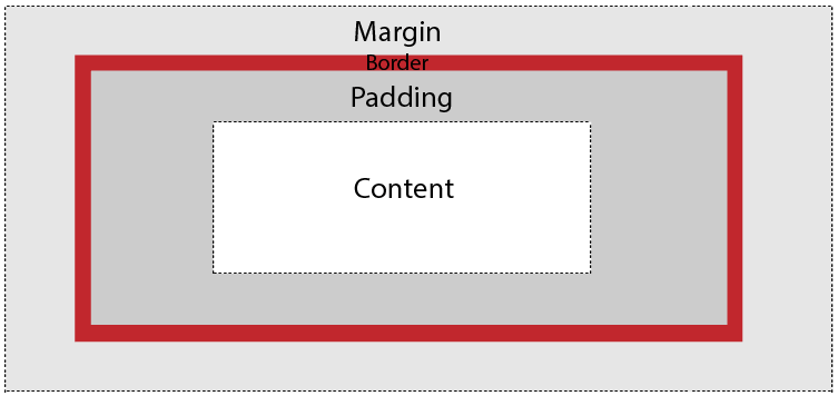
28) What is the CSS Box model and what are its elements?
The CSS box model is used to define the design and layout of elements of CSS.
The elements are:
Margin – It removes the area around the border. It is transparent.
Border – It represents the area around the padding
Padding – It removes the area around the content. It is transparent.
Content – It represents the content like text, images, etc.
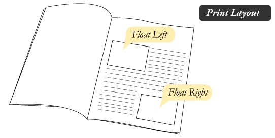
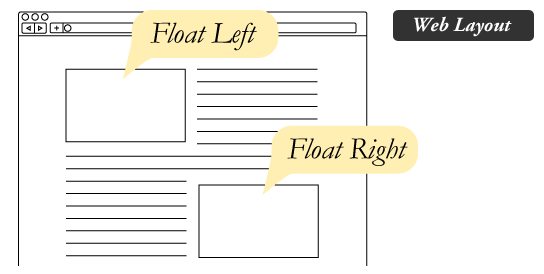
29) What is the float property of CSS?
The CSS float property is used to move the image to the right or left along with the texts to be wrapped around it. It doesn’t change the property of the elements used before it.
To understand its purpose and origin, let’s take a look at its print display. In the print display, an image is set into the page such that text wraps around it as needed.
Its web layout is also just similar to print layout.
30) How to restore the default property value using CSS?
In short, there is no easy way to restore to default values to whatever a browser uses.
The closest option is to use the ‘initial’ property value, which restores the default CSS values, rather than the browser’s default styles.
31) What is the purpose of the z-index and how is it used?
The z-index helps to specify the stack order of positioned elements that may overlap one another. The z-index default value is zero and can take on either a positive or negative number.
An element with a higher z-index is always stacked above than a lower index.
Z-Index can take the following values:
Auto: Sets the stack order equal to its parents.
Number: Orders the stack order.
Initial: Sets this property to its default value (0).
Inherit: Inherits this property from its parent element.
32) Explain the difference between visibility: hidden and display: none?
visibility: hidden hides the element, but it occupies space and affects the layout of the document.
<!DOCTYPE html>
<html>
<head>
<style>
h1.vis {
visibility: visible;
}
h1.hid {
visibility: hidden;
}
</style>
</head>
<body>
<h1class=“vis”>It is visible</h1>
<h1class=“hid”>It is hidden</h1>
<p>Note – Second heading is hidden, but it still occupy space.</p>
</body>
</html>
display: none also hides the element but not occupy space. It will not affect the layout of the document.
<!DOCTYPE html>
<html>
<head>
<style>
h1.vis {
display: block;
}
h1.hid {
display: none;
}
</style>
</head>
<body>
<h1class=“vis”>It is visible</h1>
<h1class=“hid”>It is hidden</h1>
<p>Note – Second heading is hidden and not occupy space.</p>
</body>
</html>
33) What do you understand by W3C?
W3C stands for World Wide Web Consortium. Its purpose is to deliver the information of the World Wide Web. It also develops rules and guidelines for the Web.
34) What is tweening?
It is the process of generating intermediate frames between two images.
It gives the impression that the first image has smoothly evolved into the second one.
It is an important method used in all types of animations.
In CSS3, Transforms (matrix, translate, rotate, scale) module can be used to achieve tweening.
35) What is the difference between CSS2 and CSS3?
The main difference between CSS2 and CSS3 is that CSS3 is divided into different sections which are also known as modules. Unlike CSS2, CSS3 modules are supported by many browsers.
Apart from that, CSS3 contains new General Sibling Combinators which is responsible for matching the sibling elements with the given elements.
What is CSS?
CSS stands for Cascading Style Sheet. It’s a style sheet language that determines how the elements/contents in the page are looked/shown. CSS is used to develop a consistent look and feel for all the pages.
CSS was developed and is maintained by the World Wide Web Consortium (W3C). It was first released on December 17, 1996. The CSS Working group currently working with different browser vendors to add/enforce the new feature/ specifications in all the browsers.
CSS enables the separation of the content from the presentation. This separation provides a lot of flexibility and control over how the website has to look like. This is the main advantage of using CSS.
CSS3 or Cascading Style Sheets Level 3 is the third version of the CSS standard that is used to style and format web pages. CSS3 incorporates CSS2 standard with some improvements over it. The main change in CSS3 is the inclusion of divisions of standards into different modules that makes CSS3 easier to learn and understand. Learn More.
This article covers the most frequently asked CSS and CSS3 interview questions for freshers and experienced candidates.
Crack your next tech interview with confidence!
Take a free mock interview, get instant⚡️ feedback and recommendation💡
Register Now
CSS Interview Questions For Freshers
1. What is the Box model in CSS? Which CSS properties are a part of it?
A rectangle box is wrapped around every HTML element. The box model is used to determine the height and width of the rectangular box. The CSS Box consists of Width and height (or in the absence of that, default values and the content inside), padding, borders, margin.
Content: Actual Content of the box where the text or image is placed.
Padding: Area surrounding the content (Space between the border and content).
Border: Area surrounding the padding.
Margin: Area surrounding the border.
2. What are the advantages of using CSS?
The main advantages of CSS are given below:
Separation of content from presentation – CSS provides a way to present the same content in multiple presentation formats in mobile or desktop or laptop.
Easy to maintain – CSS, built effectively can be used to change the look and feel complete by making small changes. To make a global change, simply change the style, and all elements in all the web pages will be updated automatically.
Bandwidth – Used effectively, the style sheets will be stored in the browser cache and they can be used on multiple pages, without having to download again.
3. What are the limitations of CSS?
Disadvantages of CSS are given below:
Browser Compatibility: Some style selectors are supported and some are not. We have to determine which style is supported or not using the @support selector).
Cross Browser issue: Some selectors behave differently in a different browser).
There is no parent selector: Currently, Using CSS, you can’t select a parent tag.
You can download a PDF version of Css Interview Questions.
Add your CSS rules between the opening and closing style tags and write your CSS exactly the same way as you do in stand-alone stylesheet files.
3 – Add inline styles to HTML elements(CSS rules applied directly within an HTML tag.): Style can be added directly to the HTML element using a style tag.
4 – Import a stylesheet file (An external file imported into another CSS file): Another way to add CSS is by using the @import rule. This is to add a new CSS file within CSS itself.
@import"path/to/style.css";
5. What are the different types of Selectors in CSS?
A CSS selector is the part of a CSS ruleset that actually selects the content you want to style. Different types of selectors are listed below.
Universal Selector: The universal selector works like a wildcard character, selecting all elements on a page. In the given example, the provided styles will get applied to all the elements on the page.
Element Type Selector: This selector matches one or more HTML elements of the same name. In the given example, the provided styles will get applied to all the ul elements on the page.
ul {
line-style: none;
border: solid 1px#ccc;
}
ID Selector: This selector matches any HTML element that has an ID attribute with the same value as that of the selector. In the given example, the provided styles will get applied to all the elements having ID as a container on the page.
Class Selector: The class selector also matches all elements on the page that have their class attribute set to the same value as the class. In the given example, the provided styles will get applied to all the elements having ID as the box on the page.
Descendant Combinator: The descendant selector or, more accurately, the descendant combinator lets you combine two or more selectors so you can be more specific in your selection method.
This declaration block will apply to all elements that have a class of box that is inside an element with an ID of the container. It’s worth noting that the .box element doesn’t have to be an immediate child: there could be another element wrapping .box, and the styles would still apply.
Child Combinator: A selector that uses the child combinator is similar to a selector that uses a descendant combinator, except it only targets immediate child elements.
The selector will match all elements that have a class of box and that are immediate children of the #container element. That means, unlike the descendant combinator, there can’t be another element wrapping .box it has to be a direct child element.
General Sibling Combinator: A selector that uses a general sibling combinator to match elements based on sibling relationships. The selected elements are beside each other in the HTML.
In this example, all paragraph elements (<p>) will be styled with the specified rules, but only if they are siblings of <h2> elements. There could be other elements in between the <h2> and <p>, and the styles would still apply.
Adjacent Sibling Combinator: A selector that uses the adjacent sibling combinator uses the plus symbol (+), and is almost the same as the general sibling selector. The difference is that the targeted element must be an immediate sibling, not just a general sibling.
The above example will apply the specified styles only to paragraph elements that immediately follow other paragraph elements. This means the first paragraph element on a page would not receive these styles. Also, if another element appeared between two paragraphs, the second paragraph of the two wouldn’t have the styles applied.
Attribute Selector: The attribute selector targets elements based on the presence and/or value of HTML attributes, and is declared using square brackets.
6. What is a CSS Preprocessor? What are Sass, Less, and Stylus? Why do people use them?
A CSS Preprocessor is a tool used to extend the basic functionality of default vanilla CSS through its own scripting language. It helps us to use complex logical syntax like – variables, functions, mixins, code nesting, and inheritance to name a few, supercharging your vanilla CSS.
SASS: Sass is the acronym for “Syntactically Awesome Style Sheets”. SASS can be written in two different syntaxes using SASS or SCSS
SASS vs SCSS
SASS is based on indentation and SCSS(Sassy CSS) is not.
SASS uses .sass extension while SCSS uses .scss extension.
SASS doesn’t use curly brackets or semicolons. SCSS uses it, just like the CSS.
LESS: LESS is an acronym for “Leaner Stylesheets”. LESS is easy to add to any javascript projects by using NPM or less.js file. It uses the extension .less.
LESS syntax is the same as the SCSS with some exceptions. LESS uses @ to define the variables.
Stylus: Stylus offers a great deal of flexibility in writing syntax, supports native CSS as well as allows omission of brackets, colons, and semicolons. It doesn’t use @ or $ for defining variables.
/* STYLUS SYNTAX WRITTEN LIKE NATIVE CSS */font-color= #fff;
bg-color = #00f;
#box {
color: font-color;
background: bg-color;
}
/* OR *//* STYLUS SYNTAX WITHOUT CURLY BRACES */font-color= #fff;
bg-color = #00f;
#boxcolor: font-color;
background: bg-color;
7. What is VH/VW (viewport height/ viewport width) in CSS?
It’s a CSS unit used to measure the height and width in percentage with respect to the viewport. It is used mainly in responsive design techniques. The measure VH is equal to 1/100 of the height of the viewport. If the height of the browser is 1000px, 1vh is equal to 10px. Similarly, if the width is 1000px, then 1 vw is equal to 10px.
8. Difference between reset vs normalize CSS?. How do they differ?
Reset CSS: CSS resets aim to remove all built-in browser styling. For example margins, paddings, font-sizes of all elements are reset to be the same.
Normalize CSS: Normalize CSS aims to make built-in browser styling consistent across browsers. It also corrects bugs for common browser dependencies.
9. What is the difference between inline, inline-block, and block?
Block Element: The block elements always start on a new line. They will also take space for an entire row or width. List of block elements are <div>, <p>.
Inline Elements: Inline elements don’t start on a new line, they appear on the same line as the content and tags beside them. Some examples of inline elements are <a>, <span> , <strong>, and <img> tags.
Inline Block Elements: Inline-block elements are similar to inline elements, except they can have padding and margins and set height and width values.
10. Is it important to test the webpage in different browsers?
It’s most important to test a website in different browsers when you’re first designing it, or when making major changes. However, it’s also important to repeat these tests periodically, since browsers go through a lot of updates and changes.
11. What are Pseudo elements and Pseudo classes?
Pseudo-elements allows us to create items that do not normally exist in the document tree, for example ::after.
::before
::after
::first-letter
::first-line
::selection
In the below example, the color will appear only on the first line of the paragraph.
Pseudo-classes select regular elements but under certain conditions like when the user is hovering over the link.
:link
:visited
:hover
:active
:focus
Example of the pseudo-class, In the below example, the color applies to the anchor tag when it’s hovered.
/* mouse over link */a:hover {
color: #FFOOFF;
}
12. How do you specify units in the CSS?. What are the different ways to do it?
There are different ways to specify units in CSS like px, em, pt, percentage (%). px(Pixel) gives fine-grained control and maintains alignment because 1 px or multiple of 1 px is guaranteed to look sharp. px is not cascade. em maintains relative size. you can have responsive fonts. Em, will cascade 1em is equal to the current font-size of the element or the browser default. If u sent font-size to 16px then 1em = 16px. The common practice is to set default body font-size to 62.5% (equal to 10px).
pt(point) are traditionally used in print. 1pt = 1/72 inch and it is a fixed-size unit.
%(percentage) sets font-size relative to the font size of the body. Hence, you have to set the font-size of the body to a reasonable size.
13. Does margin-top or margin-bottom have an effect on inline elements?
No, it doesn’t affect the inline elements. Inline elements flow with the contents of the page.
14. What property is used for changing the font face?
We can use the font-family property for achieving this. The font-family property is used for specifying what font needs to be applied on the targetted DOM element. It can hold several font names as part of “fallback” mechanism in case the browser does not support the fonts. For example, we can use:
 p {
  font-family: "Times New Roman", Times, serif;
}
In the above piece of code, we are applying font-family property to the paragraph element.
It tells the browser to look for “Times New Roman” font and apply it.
If the “Times New Roman” font is not installed or supported, then it asks the browser to use Times font.
If both “Times New Roman” and Times are not supported, then it asks the browser to use any supported generic font belonging to serif.
If you do not want the font-face of the paragraph element to be Times New Roman/Times/serif font, and you want to use the Arial/Helvetica/sans-serif font, then we can just update the CSS property of paragraph element as:
 p {
  font-family: Arial, Helvetica, sans-serif;
}
15. What are the differences between adaptive design and responsive design?
Adaptive Design
Responsive Design
Adaptive design focuses on developing websites based on multiple fixed layout sizes.
Responsive design focuses on showing content on the basis of available browser space.
When a website developed using adaptive design is opened on the desktop browser, first the available space is detected and then the layout with most appropriate sizes are picked and used for the display of contents. Resizing of browser window has no affect on the design.
When a website developed using responsive design is opened on a desktop browser and when we try to resize the browser window, the content of the website is dynamically and optimally rearranged to accomodate the window.
Usually, adaptive designs use six standard screen widths – 320 px, 480 px, 760 px, 960 px, 1200 px, 1600 px. These sizes are detected and appropriate layouts are loaded.
This design makes use of CSS media queries for changing styles depending on the target devices properties for adapting to different screens.
It takes a lot of time and effort to first examine the options and realities of the end users and then design best possible adaptive solutions them.
Generally, Responsive design takes much less work to build and design fluid websites that can accomodate content from screen depending on the screen size.
Gives a lot of control over the design to develop sites for specific screens.
No much control over the design is offered here.
16. How are the CSS selectors matched against the elements by the browser?
The order of matching selectors goes from right to left of the selector expression. The elements in the DOM are filtered by browsers based on the key selectors and are then traversed up to the parent elements for determining the matches. The speed of determining the elements depends on the length of the chain of selectors. Consider an example:
 p span{
    color: black;
}
Here, the browser first finds all span elements in the DOM and then it traverses to each of its parent elements to check if they are the paragraph p elements.
Once the browser finds all matching span tags having paragraph elements as parent and applies the color of black to the content, the matching process is stopped.
17. How is border-box different from content-box?
content-box is the default value box-sizing property. The height and the width properties consist only of the content by excluding the border and padding. Consider an example as shown:
Here, the box-sizing for the div element is given as content-box. That means, the height and width considered for the div content exclude the padding and border. We will get full height and width parameters specified for the content as shown in the below image.
The border-box property includes the content, padding and border in the height and width properties. Consider an example as shown:
Here, the box-sizing for the div element is given as border-box. That means the height and width considered for the div content will also include the padding and border. This means that the actual height of the div content will be:
actual height = height -
                padding on top and bottom -
                border on top and bottom
              = 200 - (15*2) - (5*2)
              = 160 px
and the actual width of the div content would be:
actual width  = width -
                padding on right and left -
                border on right and left
              = 300 - (15*2) - (5*2)
              = 260 px
This is represented in the image below:
18. How is opacity specified in CSS3?
Opacity refers to the degree to which the content is transparent or opaque. We can use the property named opacity which takes the values ranging from 0 to 1. 0 specifies that the element is completely transparent where 1 means that the element is completely opaque. We can use the opacity property as follows:
 div {
    opacity: 0.6;
}
In the above example, an opacity of 60% is applied to the div section. The opacity property is not supported by the internet explorer browser. To make it work there, we need to use filter property as polyfill as shown in the example below.
 div {
    opacity: 0.6;
    filter: alpha(opacity=60);
}
19. Why should we use float property in CSS?
The float property is used for positioning the HTML elements horizontally either towards the left or right of the container. For instance,
 float-demo {
     float: right;
}
Here, the element to which the class is applied ensures that the element is positioned on the right of the container. If you specify the value of float as left, then the element will be placed on the left side of the container.
20. What is a z-index, how does it function?
z-index is used for specifying the vertical stacking of the overlapping elements that occur at the time of its positioning. It specifies the vertical stack order of the elements positioned that helps to define how the display of elements should happen in cases of overlapping.
The default value of this property is 0 and can be either positive or negative. Apart from 0, the values of the z-index can be:
Auto: The stack order will be set equal to the parent.
Number: The number can be positive or negative. It defines the stack order.
Initial: The default value of 0 is set to the property.
Inherit: The properties are inherited from the parent.
The elements having a lesser value of z-index is stacked lower than the ones with a higher z-index.
From the above figure, we can see that as the value of the z-index increases along the z-axis, the order of stacking would be towards the top of other elements along the vertical axis.
21. What do the following CSS selectors mean?
div, p
div p
div ~ p
div + p
div > p
The meaning of the given list of selectors goes as follows:
div, p: This selector implies selecting all div elements and all p elements.
Here, all the div elements and the p elements would be selected by the browser irrespective of their parents or where they are placed. The remaining tags like h1 and span are ignored.
div p : This selector tells to select all p elements that are inside div elements. Consider an example below:
  <h1>Heading 1</h1>
<div>
    Division 1
    <p> paragraph 1</p> <!-- Will be selected -->
    <div>
        <p> Inner Div Paragraph </p> <!-- Will be selected -->
    </div>
</div>
<p> paragraph 2</p>
<p> paragraph 3</p>
<div>
    Division 2
</div>
<span> Span 1 </span>
Here, <p> paragraph 1</p> and <p> Inner Div Paragraph </p> would be selected by the browser and the properties are applied. The rest of the paragraph tags are not selected.
div ~ p : This selector tells to select all p elements that have div elements preceeded anywhere. Consider an example,
<h1>Heading 1</h1>
<div>
   Division 1
   <p> paragraph 1</p>
</div>
<p> paragraph 2</p> <!-- Will be selected -->
<p> paragraph 3</p> <!-- Will be selected -->
<div>
   Division 2
</div>
<span> Span 1 </span>
Here, paragraph 2 and paragraph 3 elements would be selected as marked in the code above.
div + p : This selector says to select all p elements placed immediately after the div element. Consider an example in this case:
Only <p> paragraph 1</p> will be selected in this case because it has immediate div as the parent.
22. What are the properties of flexbox?
Flexbox stands for flexible box and it was introduced around 2017 in CSS with the purpose of providing an efficient way to handle layouts, align elements within them and distribute spaces amongst the items in dynamic/responsive conditions. It provides an enhanced ability to alter the dimensions of the items and make use of the available space in the container efficiently. In order to achieve this, CSS3 provides some properties.
The properties of flexbox are as follows:
flex-direction: This property helps in defining the direction the container should stack the items targetted for flex. The values of this property can be
row: Stacks items horizontally from left to right in the flex container.
column: Stacks items vertically from top to bottom in the flex container.
row-reverse: Stacks items horizontally from right to left in the flex container.
column-reverse: Stacks items vertically from bottom to top in the flex container.
flex-wrap: This property specifies of the flex items should be wrapped or not. Possible values are:
wrap: The flex items would be wrapped if needed.
nowrap: This is the default value that says the items won’t be wrapped.
wrap-reverse: This specifies that the items will be wrapped if needed but in reverse order.
flex-flow: This property is used for setting both flex-direction and flex-wrap properties in one statement.
justify-content: Used for aligning the flex items. Possible values are:
center: It means that all the flex items are present at the center of the container.
flex-start: This value states that the items are aligned at the start of the container. This is the default value.
flex-end: This value ensures the items are aligned at the end of the container.
space-around: This value displays the items having space between, before, around the items.
space-between: This value displays items with spaces between the lines.
align-items: This is used for aligning flex items.
align-content: This is used for aligning the flex lines.
23. What is cascading in CSS?
“Cascading” refers to the process of going through the style declarations and defining weight or importance to the styling rules that help the browser to select what rules have to be applied in times of conflict. The conflict here refers to multiple rules that are applicable to a particular HTML element. In such cases, we need to let the browser know what style needs to be applied to the element. This is done by cascading down the list of style declarations elements.
For example, if we have the below style:
p{
    color:white;
}
and we also have the following declaration below it or in another stylesheet that has been linked to the page:
p{
    color: black;
}
We have a conflict in color property here for the paragraph elements. Here, the browser just cascades down to identify what is the most recent and most specific style and applies that. Since we have the color:black; as the most specific declaration, the color black is applied to the paragraph elements. Now if you want to ensure color white is applied to the paragraph, we can define weight to that style by adding !important as shown below:
p{
    color:white !important;
}
!important ensures that the property has the maximum weight in presence of other conflicting properties.
CSS Interview Questions for Experienced
24. Explain CSS position property?
Absolute: To place an element exactly where you want to place it. absolute position is actually set relative to the element’s parent. if no parent is available then the relative place to the page itself (it will default all the way back up to the element).
Relative: “Relative to itself”. Setting position: relative; on an element and no other positioning attributes, it will no effect on its positioning. It allows the use of z-index on the element and it limits the scope of absolutely positioned child elements. Any child element will be absolutely positioned within that block.
Fixed: The element is positioned relative to the viewport or the browser window itself. viewport doesn’t change if you scroll and hence the fixed element will stay right in the same position.
Static: Static default for every single page element. The only reason you would ever set an element to position: static is to forcefully remove some positioning that got applied to an element outside of your control.
Sticky: Sticky positioning is a hybrid of relative and fixed positioning. The element is treated as relative positioned until it crosses a specified threshold, at which point it is treated as fixed positioned.
25. When does DOM reflow occur?
Reflow is the name of the web browser process for re-calculating the positions and geometries of elements in the document, for the purpose of re-rendering part or all of the document.
Reflow occurs when:
Insert, remove or update an element in the DOM.
Modify content on the page, e.g. the text in an input box.
Move a DOM element.
Animate a DOM element.
Take measurements of an element such as offsetHeight or getComputedStyle.
Change a CSS style.
26. Different Box Sizing Property?
The box-sizing CSS property sets how the total width and height of an element are calculated.
Content-box: The default width and height values apply to the element’s content only. The padding and border are added to the outside of the box.
Padding-box: Width and height values apply to the element’s content and its padding. The border is added to the outside of the box. Currently, only Firefox supports the padding-box value.
Border-box: Width and height values apply to the content, padding, and border.
28. Can you name the four types of @media properties?
The four types of @media properties are:
All → It’s the default property. Used for all media-type devices.
Screen → Used for computer screen, mobile screen.
Print → Used for printers.
Speech → Used for screen readers.
29. What is the grid system?
CSS Grid Layout is the most powerful layout system available in CSS. It is said to be a 2-dimensional system, meaning it can handle both columns and rows, unlike flexbox which is largely a 1-dimensional system.
30. What are the different ways to hide the element using CSS?
Using display property(display: none). It’s not available for screen readers. The element will not exist in the DOM if display: none is used.
Using visibility property(visibility: hidden), will take up the space of the element. It will be available to screen reader users. The element will actually be present in the DOM, but not shown on the screen.
Using position property (position: absolute). Make it available outside the screen.
31. What does the :root pseudo-class refer to?
The :root selector allows you to target the highest-level “parent” element in the DOM, or document tree. It is defined in the CSS Selectors Level 3 specification.
32. What does Accessibility (a11y) mean?
Accessibility refers to how software or hardware combinations are designed to make a system accessible to persons with disabilities, such as visual impairment, hearing loss, or limited dexterity.
For example, a website developed with accessibility in mind might have text-to-speech capabilities. In the USA public websites have to have accessible compliance. It’s defined in 508 compliance. It gives the guidelines and best practices for all website users that should be met with key areas of accessibility.
33. How do I restore the default value of a property?
The keyword initial can be used to reset it to its default value.
34. Difference between CSS grid vs flexbox?
CSS Grid Layout is a two-dimensional system, meaning it can handle both columns and rows. Grid layout is intended for larger-scale layouts which aren’t linear in design.
Flexbox is largely a one-dimensional system (either in a column or a row). Flexbox layout is most appropriate to the components of an application.
35. How does Calc work?
The CSS3 calc() function allows us to perform mathematical operations on property values. Instead of declaring, for example, static pixel values for an element’s width, we can use calc() to specify that the width is the result of the addition of two or more numeric values.
.foo {
	Width: calc(100px + 50px)
}
36. What do CSS Custom properties variables mean?
Custom properties (sometimes referred to as CSS variables or cascading variables) are defined by users that contain specific values to be reused throughout a document. The value is set using — notion. And the values are accessed using the var() function.
37. What is the difference between CSS variables and preprocessor(SASS, LESS, Stylus) variables?
CSS variables can be used without the need for a preprocessor. Currently, all the major browsers support the CSS variables.
CSS variable cascade. But the preprocessor variables don’t cascade.
CSS variable can be accessed and manipulated in javascript.
38. What does * { box-sizing: border-box; } do? What are its advantages?
It makes every element in the document include the padding and border in the element’s inner dimension for the height and width computation.
In box-sizing: border-box, The height of an element is now calculated by the content’s height + vertical padding + vertical border width.
The width of an element is now calculated by the content’s width + horizontal padding + horizontal border width.
39. What does !important mean in CSS?
The style is having the important will have the highest precedence and it overrides the cascaded property.
 p {
 	color: red !important;
 }
 #thing {
 	color: green;
 }
 <p id="thing">Will be RED.</p>
40. What is specificity? How to calculate specificity?
A process of determining which CSS rule will be applied to an element. It actually determines which rules will take precedence. Inline style usually wins then ID then the class value (or pseudo-class or attribute selector), the universal selector (*) has no specificity. ID selectors have a higher specificity than attribute selectors.
41. What is progressive rendering? How do you implement progressive rendering in the website?. What are the advantages of it?
Progressive rendering is the name given to techniques used to improve the performance of a webpage (in particular, improve perceived load time) to render content for display as quickly as possible.
We can implement the progressive rendering of the page by loading the lazy loading of the images. We can use Intersection Observer API to lazy load the image. The API makes it simple to detect when an element enters the viewport and take an action when it does. Once the image enters the viewport, we will start loading the images.
A sample snippet is given below.
<img class="lazy"
src="placeholder-image.jpg"
data-src="image-to-lazy-load-1x.jpg"
data-srcset="image-to-lazy-load-2x.jpg2x, image-to-lazy-load-1x.jpg1x"
alt="I'm an image!">
document.addEventListener("DOMContentLoaded", function() {
var lazyImages = [].slice.call(document.querySelectorAll("img.lazy"));
if ("IntersectionObserver" in window) {
let lazyImageObserver = new IntersectionObserver(function(entries, observer) {
entries.forEach(function(entry) {
if (entry.isIntersecting) {
let lazyImage = entry.target;
lazyImage.src = lazyImage.dataset.src;
lazyImage.srcset = lazyImage.dataset.srcset;
lazyImage.classList.remove("lazy");
lazyImageObserver.unobserve(lazyImage);
}
});
});
lazyImages.forEach(function(lazyImage) {
lazyImageObserver.observe(lazyImage);
});
} else {
// Possibly fall back to event handlers here
}
});
42. What are the advantages of using translate() instead of absolute position?
Translate() does not cause the browser to trigger repaint and layout and instead only acts on the compositor. The absolute position triggers the repaint or DOM reflow. So, translate() gives better performance.
43. Does style1.css have to be downloaded and parsed before style2.css can be fetched?
No, the browsers will download the CSS in the order of its appearance on the HTML page.
44. How to determine if the browser supports a certain feature?
The @support in CSS can be very useful to scan if the current browser has support for a certain feature.
@supports (display: grid) {
	div {
		display: grid;
	}
}
45. How does the absolute positioning work?
Absolute positioning is a very powerful positioning mechanism that allows users to place any element wherever they want in an exact location. The CSS properties right, left, top, bottom and define the exact locations where you need to place the element. In absolute positioning, the following points need to be considered:
The element to which the absolute positioning is applied is removed from the normal workflow of the HTML document.
The HTML layout does not create any space for that element in its page layout.
The element is positioned relative to the closest positioned ancestor. If no such ancestor is present, then the element is placed relative to the initial container block.
The final position of the element is determined based on values provided to the top, right, left, bottom.
46. How does this property work overflow: hidden?
The overflow property in CSS is used for specifying whether the content has to be clipped or the scrollbars have to be added to the content area when the content size exceeds the specified container size where the content is enclosed. If the value of overflow is hidden, the content gets clipped post the size of the container thereby making the content invisible. For example,
div {
    width: 150px;
    height: 50px;
    overflow: hidden;
}
If the content of the div is very large and exceeds the height of 50px, the content gets clipped post 50px and the rest of the content is not made visible.
47. How will you align content inside the p tag at the exact center inside the div?
We can add the text-align: center property inside the parent div for aligning the contents horizontally. But it will not align the contents vertically. We can align the content vertically by making the parent element have relative positioning and the child element have absolute positioning. The child element should have the values of top, bottom, right, left as 0 to center it in the middle vertically. Then we need to set the margin as auto. It is assumed that both the child and mother elements will have height and width values.
Consider we have a div element of height and width taking 20% of the screen size, and we have a paragraph element taking the height of 1.2em and width of 20%. If we want to align the paragraph element at the center (vertically and horizontally), we write the following styles:
div {
    position : relative;  // Make position relative
    height : 20%;
    width : 20%;
    text-align : center; //Align to center horizontally
}
p {
    position : absolute; // Make position absolute
    top:0;                // Give values of top, bottom,left, right to 0
    bottom:0;
    left:0;
    right:0;
    margin : auto;        // Set margin as auto
    height : 1.2 em;
    width : 20%;
}
48. How is margin different from padding in CSS?
Margin property using which we can create space around the elements. We can also create space for borders defined at the exteriors. We have the following properties for defining the margin:
margin-top
margin-right
margin-bottom
margin-left margin property by itself has the values as:
auto – The browser auto-calculates the margin while we use this.
length – The value of this property can be in px, pt, cm, em etc. The values can be positive or negative.
% – We can also give percentage value as margin to the element.
inherit – Using this property, the margin properties can be inherited from the parent elements.
The padding property is used for generating the space around the element’s content and inside any known border. The padding also has sub-properties like:
padding-top
padding-right
padding-bottom
padding-left
It is to be noted that the padding does not allow negative values.
From the below image, we can see that the Margin is the outermost entity of the CSS Box Model that lies outside of the borders whereas the padding lies within the borders.
49. What do you have to do to automatically number the heading values of sections and categories?
We can use the concept of CSS counters. This lets us adjust the appearance of the content based on the location in a document. While using this, we need to first initialize the value of the counter-reset property which is 0 by default. The same property is also used for changing the value to any number that we need. Post initialization, the counter’s value can be incremented or decremented by using the counter-increment property. The name of the counter cannot be CSS keywords like “none”, “initial”, “inherit” etc. If the CSS keywords are used, then the declaration would be ignored.
Consider an example as shown below:
body {
  counter-reset: header;   /* define counter named 'header' whose initial value is 0 by default */
}

h2::before {
  counter-increment: header;   /* The value of header counter by 1.*/
  content: "Header " counter(header) ": ";  /* To display word Header and the value of the counter with colon before it.*/
}
Here, we are trying to achieve auto count increment and display feature for the h2 tag. Wherever we use h2 tag, the content will be prefixed by “Header 1 : ” , “Header 2 : “, “Header 3 : ” etc.
50. How is the nth-child() different from nth of type selectors?
Both are pseudo-classes (Pseudo-classes are those keywords that specifies the special state of the selected element). The nth-child() pseudo-class is used for matching elements based on the number that represents the position of an element based on the siblings. The number is used to match an element on the basis of the element’s position amongst its siblings.
For example, in the below piece of code, if we give nth-child(4) for the example class, then the 4th child of the example class is selected irrespective of the element type. Here, the fourth child of the example class is the div element. The element is selected and a background of black is added to it.
.example:nth-child(4) {
    background: black;
}
<div class="example">
	<p>This is a paragraph.</p>
	<p>This is a paragraph.</p>
	<p>This is a paragraph.</p>
	<div>This is a div.</div> <!-- 4th Element to select and apply style-->
	<div>This is a div.</div>
	<p>This is a paragraph.</p>
	<p>This is a paragraph.</p>
	<div>This is a div.</div>
</div>
The nth-of-type() pseudo-class is similar to the nth-child but it helps in matching the selector based on a number that represents the position of the element within the elements that are the siblings of its same type. The number can also be given as a function or give keywords like odd or even.
For example, in the below piece of code, if we give p:nth-of-type(even) for the example class, then all the even paragraph tags are selected within the example class and the style of background black is applied to them. The selected elements are marked in comments in the below code:
.example p:nth-of-type(even) {
background: black;
}
<div class="example">
<p>This is a paragraph.</p>
<p>This is a paragraph.</p> <!-- Select thisand apply style-->
<p>This is a paragraph.</p>
<div>This is a div.</div>
<div>This is a div.</div>
<p>This is a paragraph.</p> <!-- Select thisand apply style-->
<p>This is a paragraph.</p>
<div>This is a div.</div>
<p>This is a paragraph.</p> <!-- Select thisand apply style-->
<div>This is a div.</div>
</div>
51. What is the importance of CSS Sprites?
CSS sprites are used for combining multiple images in a single larger image. They are commonly used for representing icons that are used in the user interfaces. The main advantages of using sprites are:
It reduces the number of HTTP requests to get data of multiple images as they are acquired only by sending a single request.
It helps in downloading assets in advance that help display icons or images upon hover or other pseudo-states.
When there are multiple images, the browser makes separate calls to get the image for each of them. Using sprites, the images are combined in one and we can just call for that image using one call.
Consider an example where our application requires 3 images as shown below (Without Sprites Section). If we are trying to load the images independently, we require 3 different HTTP Requests to get the data. But if we have CSS Sprites where all 3 images are combines into 1 separated by some spaces, then we require only 1 HTTP Request.
We can access each image from the sprite by accessing the positioning properties as shown in the below code:
<!DOCTYPE html><html><head><style>#home-icon {
left: 0px;
width: 46px;
background: url('spriteFile.gif') 00;
}
#prev-icon {
left: 63px;
width: 43px;
background: url('spriteFile.gif') -47px0;
}
#next-icon {
left: 129px;
width: 43px;
background: url('spriteFile.gif') -91px0;
}
</style></head><body><imgid="home-icon"src="spriteFile.gif"width="1"height="1"><!-- To display home icon here --><imgid="next-icon"src="spriteFile.gif"width="1"height="1"><!-- To display next icon icon here --><imgid="prev-icon"src="spriteFile.gif"width="1"height="1"><!-- To display previous icon icon here --></body></html>
In the above code, we are trying to access each element – house, previous and next icon – from the sprite file by using the left, width properties. The image is displayed in the img section by means of the background property. Do note that the source of the image (src attribute of the img tag) is just one file which is the spriteFile.gif and depending on the rules specified in the id selectors, the images are loaded accordingly.
52. What do you understand by tweening in CSS?
Tweening is the process of filling the gaps between the key sequences, i.e between the keyframes that are already created. Keyframes are those frames that represent start and end point of animation action. Tweening involves generating intermediate keyframes between two images that give the impression that the first one has evolved smoothly to the second image. For this purpose, we use properties like transforms – matrix, translate, scale, rotate etc.
In the below example, we are generating intermediate frames of paragraph elements to slide through from the start to the right edge of the browser.
p {
  animation-duration: 2s;
  animation-name: slidethrough;
}

@keyframes slidethrough {
  from {
    margin-left: 100%;
    width: 300%;
  }

  to {
    margin-left: 0%;
    width: 100%;
  }
}
Here, the paragraph element specifies that the animation process should take 2 seconds for execution from start to the finish. This is done by using the animation-duration property. The animation-name of the @keyframes is defined by using the property animation-name. The intermediate keyframes are defined by using @keyframes rule. In the example, we have just 2 keyframes. The first keyframe starts at 0% and runs till the left margin of 100% which is the rightmost edge of the containing element. The second keyframe starts at 100% where the left margin is set as 0% and the width to be set as 100% which results in finishing the animation flush against the left edge of the container area.
53. Why do we need to use clear property along with floats in CSS?
The clear property along with floats is used for specifying which side of floating elements is not supposed to float. An element having clear property ensures that the element does not move up adjacent to the float. But the element will be moved down past the float.
Let us understand this with the help of an example. We know that the floated objects do not add to the height of the objects where they reside. Consider we have a div element with class “floated_div” within another div element with id “main_div”.
The result of this code would be as shown below. We see that the squares that are expected to be within dev are not within the main parent div. How do we fix this?
We can do it just by adding <div style="clear:both"></div> line at the end of the last floated element so that the floated elements are fit in properly within the main div container.
54. How will you fix browser-specific styling issues?
Different ways to fix browser-specific issues.
We can write browser-specific styles separately in different sheets and load that only when the specific browser is used. This makes use of the server-side rendering technique.
We can use auto-prefix for automatically adding vendor prefixes in the code.
We can also use normalize.css or reset CSS techniques.
There are some ways for avoiding browser compatibility issues too. They are as follows:
Validate HTML and CSS: We know that the code will be read, interpreted and handled differently by different browsers. We need to validate our HTML and CSS files for the missing closing tags, or missing semicolons in the syntaxes because there are chances that the old browsers will throw errors while rendering the code. We can avoid those errors by:
Maintaining well-aligned code that helps in easy readability.
Inserting comments at necessary places.
Make use of validation tools like Jigsaw CSS validator, W3C HTML Validators to identify syntax issues in the code.
Maintain Cross-Browser Compatibility in the Layouts: Cross-Browser compatibility is a must while developing web applications. We expect our application to be responsive across all devices, browsers and platforms. Some of the effects of layout incompatibilities are unresponsiveness of the layouts in mobile devices, the difference in layout rendering between modern and old browsers, etc. These incompatibilities can be avoided by using:
CSS Multi-Column layouts – For maintaining proper layouts w.r.t columns and containers.
HTML viewport metatag – For ensuring content is properly spanned across mobile devices.
CSS Flexbox and Grids – To layout child elements depending on the content and available space.
CSS resets stylesheets – For reducing browser inconsistencies in default line heights, font sizes, margins etc.
Check JavaScript Library issues: Ensure the libraries are used judiciously and the ones used are supported by the browsers.
Check DOCTYPE tag keyword: The DOCTYPE keyword is meant for defining rules of what needs to be used in the code. Older browser versions check for DOCTYPE tag at the beginning and if not found, the application rendering won’t be proper.
Test on real devices: Although applications can be tested on virtual environments, it would be more beneficial if the testing is carried out on real devices and platforms. We can use tools like Testsigma for this purpose that enables us to test in real devices parallelly.
Conclusion
CSS plays the most important role in the field of web development. This is because CSS helps in achieving beautiful, responsive or adaptive websites depending on the business requirements. CSS helps in building lighter and flexible layouts that help in loading pages faster and making the content visually appealing. CSS is continuously evolving and is becoming more powerful thereby making it the most sought-after technology by various companies to develop websites. In this article, we have seen the most commonly asked interview questions in CSS, more particularly CSS3.
SASS Interview Questions
A list of frequently asked SASS interview questions and answers are given below.
1) Define SASS?
SASS means Syntactically Awesome Style sheets. It is a CSS preprocessor which is used to reduce repetition with CSS and save time. It adds power and elegance to the basic language and facilitates you to add variables, nested rules, mixins, inline imports, inheritance and more, all with fully CSS-compatible syntax.
2) Who is the inventor of SASS?
Hampton Catlin is known as the father of SASS.
3) What are the reasons behind using SASS?
Following are some important reasons behind the popularity of SASS.
You can write codes easily and efficiently, and they are easy to maintain.
It is a pre-processing language which provides its syntax for CSS.
It is a superset of CSS which contains all the features of CSS and is an open source pre-processor, coded in Ruby.
It is more stable and powerful CSS extension and style documents more clearly and structurally.
It facilitates reusability methods, logic statements and some of the built-in functions like color manipulation, mathematics, and parameter lists item.
4) How many ways can we use SASS?
We can use SASS in three different ways:
As a command line tool.
As a standalone Ruby module.
As a plug-in for any Rack-enabled framework.
5) What are the most attractive features of SASS?
It is more stable, powerful and fully compatible to CSS3.
It is time-saving because it facilitates you to write CSS in less code.
It uses its syntax.
It is based on the JavaScript and superset of CSS.
It is an Open source pre-processor that interprets into CSS.
It contains various functions for manipulating colors and other values.
It has advanced control directives for libraries.
It provides well formatted, customizable output.
6) Which data types does the Sass Script supports?
Following data types are supported by the Sass Script:
Boolean (true or false)
Number (1, 5, 13, 10px)
Nulls
Colors (red, #FF0000)
Text String, without quote (“foo”, “bar”)
List of values that are separated by commas or space (2.0em, Verdana, Arial, Helvetica)
Maps from one value to another value (key 1: value 1, key 2: value 2)
Function reference.
SASS always supports all other types of CSS property value such as Unicode range, special character, and unquoted string.
7) Which variable is used to define SASS?
A variable begins with a dollar ($) sign, and the assignment of the variable is completed with a semicolon (;) sign.
8) Explain the difference between SCSS and Sass?
The main differences between SCSS and Sass are as follow:
Sass is like a CSS pre-processor. It has the extension of CSS3. Sass is derived from another preprocessor known as Haml.
Sass contains two types of syntax:
“SCSS” is the first syntax and it uses the extension of .scss.
Indented syntax or “Sass” is the other syntax and it uses the extension of .sass
You can covert the valid CSS document into Sass by simply change the extension from .CSS to .SCSS. It is fully CSS compatible. SCSS provides the CSS friendly syntax to closing the gap between Sass and CSS. SCSS is called Sassy CSS.
9) Explain the use of Sass @import function?
It facilitates you to extend the CSS import rule. To do this you need to enable import of Sass and SCSS files.
It can merge the all the imported files into a single outputted CSS file.
It is used to virtually match and mix any file.
It needs a filename to import function.
It provides document style presentation better than flat CSS.
It facilitates you to keep your responsive design project more organized.
10) What are the advantages of Sass?
Time saving.
More efficient and quicker.
Compatible with all versions of CSS.
You can use nested syntax and useful functions such as color manipulation, mathematics and other values.
Write clean CSS in programming construct
It is the super set of the CSS and using nested and others value.
11) What are nested rules in Sass?
Nesting is a method of combining multiple logic structures within one another. In Sass, various CSS rules are connected to one another.
For example, if you are using multiple selectors then you can use one selector inside another to create compound selectors.
12) Which one is better, Sass or Less?
Due to the following reasons, Sass is better than less:
Sass provides the facilities to use logical statements like loops, conditions and also facilitates you to write reusable methods.
The user of Sass can access the library of the company. Sass users can also use some awesome features like cross-browser support, legacy browser hacks, and dynamic sprite map generation.
Compass also provides the facilities to add an external framework like Bootstrap on top, Blueprint.
Sass provides you the facility to write your handy functions
13) What is the way to write a placeholder selector in Sass?
In Sass, the placeholder selectors can be used with class or id selector. In standard CSS, these are specified with “#” or “.”, but in SASS they are replaced with “%”. It uses @extend directive to display the result in CSS. For example:
.para1 {
color: blue;
}
.para2 {
@extend .para1;
font-size:30px;
}
14) What are number operations in Sass?
In Sass, the number operations are used for mathematical operations like addition, subtraction, multiplication and division. The Sass number operation will do something like take pixel values and convert them to percentages without much hassle.
15) What are the color operations in Sass?
In Sass, color operation allows to use color In Sass, color operation allows to use color components along with arithmetic operations.
16) How can we perform Boolean operations in Sass?
The Boolean operations can be performed on Sass script by using and, & and not operators.
17) What are parentheses in Sass?
Parentheses are used to provide a symbolic logic that affects the order of the operation. It is a pair of signs which are usually marked off by round () brackets or square [] brackets.
18) Define the use of Sass Mixin function?
The Mixin function is used to define styles. Functions and Mixins are very similar. You can re-use this style throughout the style sheet. To re-use it you do not need to resort the non-semantic classes like .float-left. The Mixin can store multiple values or parameters and call a function to avoid writing repetitive codes. It names can use underscores and hyphens interchangeably.
19) What is the use of DRY-ing out a Mixin function in Sass?
DDRY-ing out a Mixin function splits into two parts: the static part and dynamic parts.
The static Mixin contains the pieces of information that would otherwise get duplicated and the dynamic Mixin is the function that the user going to call.
20) Describe the difference between Sass comment and regular CSS comment?
Comments in regular CSS starts with /* */ and Sass contains two commands. The single line comment with // and multiple CSS comments with /* */.
21) Which directive is used to detect the errors in SASS?
Sass @debug directive is used to detect the errors and display the Sass Script expressions values to the standard error output stream. For example:
$font-sizes: 10px + 20px;
$style: (
color: #bdc3c7
);
.container{
@debug $style;
@debug $font-sizes;
}
22) What are the requirements of SASS system?
These are the requirements for Sass system:-
.Operating System – Cross platform
.Browser support – Internet Explorer, Google Chrome, Safari, Opera.
.Programming language – Ruby.
23) What is the use of @extend directive in SASS?
The SASS @extend directive is used to share a set of CSS properties from one selector to another. It is a very important and useful feature of Sass. It allows classes to share a set of properties with one another. It makes your code less and facilitates you to rewrite it repeatedly. For example:
.message
border: 1px solid #ccc
padding: 10px
color: #333
.success
@extend .message
border-color: green
.error
@extend .message
border-color: red
.warning
@extend .message
border-color: yellow
24) What is the role of @media directive in SASS?
The Sass @media directive is used to set style rules to different media types. It supports and extends the @media rules. This directive can be nested inside the selector SASS but the main impact is displayed to the top level of the style sheet. For example:-
h2{
color: violet;
}
.style{
width: 500px;
@media screen and (orientation: portrait){
width:200px;
margin-left: 80px;
}
}
25) What is the use of at-root directive in SASS?
The Sass @at-root directive is a collection of nested rules that are used to style block at the root of the document. For example:-
h2{
color: blue;
background-color: pink;
@at-root {
.style{
font-size: 20px;
font-style: bold;
color: violet;
}
}
}
LESS Interview Questions
A list of top frequently asked LESS interview questions and answers are given below.
1) What is Less?
The Learner Style Sheet (Less) is a backward-compatible language that can be compiled into the Cascading Style Sheet (CSS) and runs on both the client side and server side. It is an open source language and cross-browser compatible.
2) When does the Less programming language first invented?
The Less programming language was first invented in 2009.
3) In which language does the Less first written?
The LESS was first written in Ruby in 2009.
4)What is the current language used in Less?
Currently, Less is using JavaScript.
5) Who is the inventor of Less?
The Less is designed and developed by Alexis Sellier and Dmitry Fadeyev.
6) What is the extension of Less file?
The “.less” is the extension of the Less file. It is always required to use “.Less” extension in Less document file.
7) In how many ways we can use Less?
There are three ways to use Less:
Through the command line.
Through a third-party tool.
You can download Less as a script file for the browser.
8) How do you represent a variable in Less?
It is required to declare a variable with @ symbol and uses a colon (:) to assigned the particular value in the variable. It is also necessary to add a semi-colon (;) after the value of the variable.
For example:
@primarycolor: #FF7F50;
@color:#800080;
h1 {
color: @primarycolor;
}
h3 {
color: @color;
}
In the above example of Less, the two variables used in the Less programming having values #FF7F50 and #800080.
9) What is the use of Mixins in Less?
In Less, Mixins facilitates you to add the set of properties from one rule-set into another rule-set. It includes class names as its properties. Mixins can be declared as the same way as CSS style using a class or id selector. It can store multiple values and can be reused in the code whenever necessary.
Syntax:
.round-borders {
border-radius: 5px;
-moz-border-radius: 5px;
-webkit-border-radius: 5px;
}
#menu {
color: gray;
.round-borders;
}
10) What is the role of nesting in Less programming?
The nesting is used to make the code simple, clean and Less complicated by allowing it to follow some visual hierarchy. For example nesting of classes can be done in Less programming.
For example:
.container {
h1 {
font-size: 25px;
color:#E45456;
}
p {
font-size: 25px;
color:#3C7949;
}
.myclass {
h1 {
font-size: 25px;
color:#E45456;
}
p {
font-size: 25px;
color:#3C7949;
}
}
}
In the above Less document example of nesting myclass is the subclass of container class.
11) What are the color channel functions in Less?
In Less, color channel functions are in-built functions used to set a value about a channel according to the color definition. The HSL colors consist of hue, saturation and lightness channel and the RGB colors consist of a red, green and blue channel.
12) What is the use of data URI (Uniform Resource Identifier) in LESS?
With the help of Data URI, an image can be embedded directly in the stylesheet.
13) What does the “Source Map Less Inline” option represent?
The “Source Map Less Inline” option represents that all the CSS files must be included into the source map.
14) What is the difference between Less and SASS?
Less
Sass
Less is coded in JavaScript.
SASS is coded in ruby.
It is processed on the client side
It is processed at the client side.
Variables are declared with the @ symbol.
Variables are declared with the $ symbol.
For mixing, it uses Less Mixins.
For mixing, it uses Compass.
15) How is Less is similar to Sass?
Following are the similarities between Less and Sass:
Namespaces are similar in both.
Color functions are identical in both.
Nesting capabilities are identical in both.
JavaScript evaluations are identical in both.
16) What is &combinator in Less?
In LESS, &combinator is used to combine the nested selector with the parent selector.
17) Does Less support operations?
Yes, Less supports various arithmetic operations such +,? , *, / that can be operated on any color or variable.
18) What is the use of Escaping in Less?
The escaping is used when there is a requirement to execute CSS file with invalid syntax.
19) Are there any alternatives that can use in place of Less?
Yes, there are various other alternatives can be used in place of Less such as SCSS, stylus.
20) How can you invoke the compiler via command line in Less?
To invoke the compiler follow the below command :
$ Lessc styles.Less
21) What is the purpose of e() function in Less?
The role of e() function is to escape a value from the Less compiler.
22) How can you create a loop structure in Less?
When recursive mixins are combined with Pattern matching and guard expressions, it can create various iterative/loop structures.
23) What is the best way to pre-compile a Less into CSS?
The easiest way to pre-compile a Less into CSS is to use Less.js with Node.js where Less.js run outside the browser.
24) What is the use of Namespaces and Accessors in Less?
The namespaces were used to group the Mixins under a common name. You can perform Encapsulation with the help of Namespaces and Accessors in the Less file.
For example:
.class1 {
.class2 {
.val(@param) {
font-size: @param;
color:green;
}
}
}
.myclass {
.class1 > .class2 > .val(20px);
}
25) Define scope in the context of variables in LESS programming language.
The scope of variables refers to the place where the variables exist. The variables were searched in the local scope first. If it is not in the local scope, then the compiler search in the parent scope.
For example:
@a: 15px;
.myclass {
font-size: @a;
@a:20px;
color: green;
}
In the above Less document variable a is defined inside the class with value 20 and variable with the same name is also defined outside the class with value 15. When the compiler executes this Less document, it searches for the local scope first. Hence the local scope of the variable is used. After the compilation process, CSS file is created having font-size value 20px.
26) What is commenting?
The commenting refers to some text which is understandable by the humans to understand the working of some complex codes in the programming.
27) What is the reaction of the compiler to the comments?
The reaction of the compiler to the comments is nothing. The compiler ignores the comments at the time of compilation of the code.
28) How many types of commenting can be done in the Less document?
Two types of comments are allowed in the Less document, inline comments and block comments. However, if you write inline comments in your code, the compiler ignores it and not adds that code to the CSS file. Only block comments will be added to the CSS file.
29) What is the use of importing in Less programming? How is it done?
The importing is used to import CSS or Less document into the Less document. Importing can be done by including “@import” followed by the address of the CSS or Less file at the beginning of the Less document.
30) What is the use of extend in Less?
The extend is a Less pseudo class which is used to select another selector style in one selector.
For example:
h2 {
&:extend(.style);
font-style: italic;
}
.style {
background: green;
}
In the above example of extending style class properties have been imported into the properties of h2.
31) What are different types of functions available in Less?
The list of different types of functions in Less is as follows:


